
Logo Design / Logo Animation / Brand Identity / Web Design
Designing the Perfect Logo for Outdoor Athlete
A local new business that would soon become Outdoor Athlete, had a unique challenge in designing, personifying, and explaining their brand identity.
The goal was to create a brand that targets athletes that spend most of their time outdoors. Mainly skiers, and mountain bikers. The challenge was to make this brand shine against the already convoluted outdoor training space that exists in Colorado.

Exploring Names and Design
The brand didn’t come to us right away. After going through a non-linear creative process, we soon got a copywriter on board and started throwing every idea at the wall.
It took a lot of wrong names before landing on the right one- Outdoor Athlete.
Next up, design.
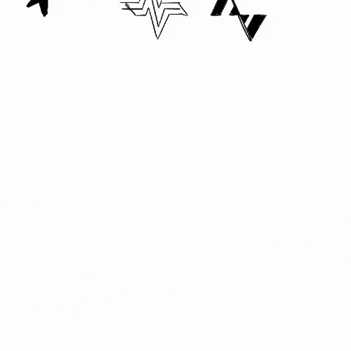
Polished final designs don’t tell the story. I wanted to include some of the designs and exploration that didn’t work, but undoubtedly led me to the end product some way or another.

Final Logo Design and Color Palette
This logo and design had to be in-tune with who the Outdoor Athlete is.
By using organic and recognizable shapes, paired with a distinct and bright color-palette, the brand finally came to life, set to inspire avid outdoor athletes.
The logo for Outdoor Athlete is an effective design, utilizing the shapes of the letters "O" and "A" in a clever way. The "A" is represented by a pine tree shape, which not only reflects the brand's connection to the outdoors but also adds a sense of strength and resilience. This logo captures the brand's mission to help outdoor athletes build a solid foundation and reach new heights.
